By Geneva Ives on April 13, 2015 in Marketing
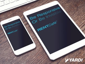
It’s increasingly apparent that the future of computing is moving from one type of screen – traditional desktop monitors – to many types of screens with a multitude of different sizes and resolutions. But computers themselves aren’t driving this sea change, consumers are. Today’s online renters are using laptops, tablets, phones and even watches to search the web for available apartments.
What does this mean for property marketing websites? To stay ahead of the curve, you need a site that looks good and functions well on any and all devices. It’s time to make the switch to responsive design. (And there’s a really good reason to do it before April 21st of this year. Keep reading to find out why it’s critical to become responsive sooner rather than later…)
What is responsive design?
Responsive design is the practice of creating a website that provides an optimal user experience across all devices. Responsive web designs resize and reformat page content in response to screen size and resolution, making your website compatible with all Internet-enabled devices.
Why is responsive design important for SEO?
Responsive design uses a single URL for all platforms, making it easy for search engine robots to crawl and index your website.
In fact, responsive design is Google’s recommended configuration. This Google Developers article details the top three things you should know when building a site for mobile devices. Guess what made the list? Yep, responsive design! The article specifically states: “Select a mobile template, theme, or design that’s consistent for all devices (i.e., use responsive web design).”
If that’s not enough to get you excited about responsive design – though we really think it should be – consider that responsive websites also tend to reduce bounce rates because they offer a better user experience across the board.
What does it mean for your property marketing?
Both prospects and residents prefer visiting and engaging with responsive websites because they get access to the same presentation, content, and functions no matter which device they’re using – whether they’re at home or on the go.
With an estimated half of apartment hunters preferring to search for places on their mobile devices, what we’re about to tell you next will make responsive design even more important to your online marketing:
According to the official Google Webmaster blog, Google will be expanding their use of mobile-friendliness as a ranking signal starting April 21, 2015. This change will affect mobile searches in all languages worldwide and will have a significant impact on search results. Assuming that your marketing plan involves ranking highly for apartment searches in your area, this is a really big deal.
How else does responsive design benefit your operations?
A single, responsive website is a lot less work to maintain than multiple websites created for a variety of devices. If you have rental updates, promotions, or policy changes, you only need to edit your content once to have it appear correctly in front of all viewers, regardless of which device a person is using to access your site. Accuracy of information increases, and data entry work decreases. Responsive design also yields only one set of analytics, which is easier to manage and interpret than multiple sets of analytic data.
Takeaway for property websites
Responsive design is more than just a passing trend. When creating your property website, design it once, design it right, and make it responsive.
Ready to tap into the benefits of responsive design to market your communities? Since 2013, RentCafe has offered responsive, customizable templates for property marketing websites, including online leasing and resident portals that can be accessed from anywhere. RentCafe helps properties attract, engage, and convert today’s online prospects, no matter which device renters use when they’re searching for a place to call home.


