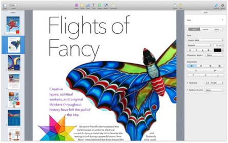
I started to write this post on Apple Pages 5.0 by creating a Microsoft Word 2010 Document and naming it Apple Pages 5.0. But something didn’t seem right. Outside the office I’m on a MacBook, and Pages is what I use to create personal documents. I am completely satisfied with its airy design, the way it communicates with my non-Pages friends and collaborators, and its seamless sharing capabilities across devices – Macs, iOS devices and Windows alike. It seemed more appropriate to write about Pages while using Pages. Pages is part of the iWork package that includes the word-processing software, a spreadsheet program, and a presentation manager. There are many for whom Pages doesn’t meet their needs, but others feel that Apple, by rewriting the word processor from scratch, got impressive results. Layers will most probably be added to meet some of the needs of the more power users. For now, the software excels especially in design, compatibility, sharing, speed, and ease of use. To better visualize Pages, for those who haven’t used it, a comparison with Word would probably be helpful. Design The first thing that hits the eyes when opening a Word document is the multitude of buttons. Every imaginable function has a tiny button somewhere on one edge of the blank sheet of paper. Apple chose the path of “less is more” – just a handful of icons across the top and a contextual panel that slides out on the right. Whenever you need to edit the text, the buttons for font type, size, the alignment style and paragraph design pop out on the right of the page. If you wish to insert a table, the panel recognizes that and switches to allow the modification of rows and columns. Adding a...

