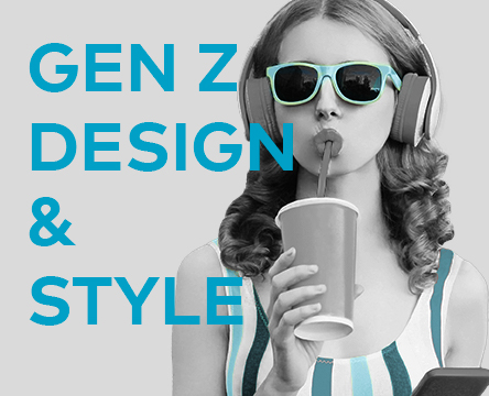
Say goodbye to Millennial Pink and hello to Gen Z Yellow! When it comes to Gen Z design preferences, this generation of renters has a style all their own. Check out the infographic and keep reading to learn how you can meet the visual expectations of your newest customers. Survey says REACH by RentCafe recently conducted a large-scale survey of Gen Z renters to gauge their sentiments about search, reviews, social media and design. The Gen Z design portion of the survey had 10,624 participants that answered four questions. Do you prefer bright and vibrant colors or soft and calm colors?73% prefer soft and calm colors27% prefer bright and vibrant colors Are you more attracted to lifestyle photos (of people and pets) or property photos (of buildings and outdoor spaces)?68% prefer property photos32% prefer lifestyle photos In design, do you prefer patterns and textures or clean, classic lines?70% prefer clean, classic lines30% prefer patterns and textures Which do you prefer: a website that loads quickly or a website with a lot of motion and animation?88% prefer a website that loads quickly12% prefer a website with a lot of motion and animation Other data Echoing the desire for calm colors and clean lines cited in the REACH survey, a Spotify trend survey conducted in 2019 found that 51% of Gen Z and millennial respondents think there is too much visual stimulation in the world today. Additionally, 64% believe online aesthetics have altered what their generation expects to see in the real world. What does this mean for property management brands? Your communities had better deliver on the experience promised by your website and other digital marketing channels. After all, the REACH survey found that Gen Z overwhelming preferred property photos to lifestyle photos, showing that...
Kitchen Trends
Hands-free, Sustainable Tech
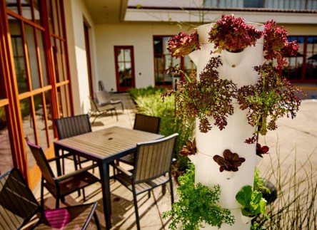
If you’re looking to set your property apart from the crowd, high-end kitchens and bathrooms are an excellent place to start. Hands-free fixtures and appliances are quickly becoming standard features in fine rentals. New options permit these luxuries at multiple price points. For builds and renovations with leaner budgets, the GE Profile Series is a great introduction to hands-free appliances. The Energy Star certified fridge and freezer combos off hands-free auto-fill dispensers. Users simply insert their vessel of choice, press of a button, and move on to other tasks while the vessel is filled. Once full, the water dispenser automatically shuts off. Kenmore Elite 51773 includes a Measured Fill auto-fill dispenser with a few additional bells and whistles. The ice and water systems have Favorite Fill configurable settings, so that your residents get the perfect quantity every time. When preparing for guests or an exceptionally steamy day, users can activate Accela Ice, which boosts ice production for 24 hours and then automatically shuts off. For kitchens and bathrooms, Delta Touch2O.xt Technology offers a range of operations. With the back of the hand, wrist, forearm or elbow, users can tap anywhere on the faucet to start or stop water flow. Some styles are equipped with true touch-free operation. Simply bring your hands within four inches of the sensor to activate water flow. To promote efficiency and resource conservation, the water shuts off within seconds of moving your hands out of the four-inch range. Safety features include an automatic shut off after one minute of uninterrupted water flow, as well as a blue indicator light to alert users that water is flowing or dripping. A step up leads to the Grohe LadyLux 3 Café and K7, two faucet styles that are activated via foot controls. The...
Powerful Plants
Improve Productivity, Morale
Plants do more than beautify your office space. They are a tested, effective, low-cost—and now, low maintenance—way to make your office space a better place to work. The presence of greenery results in increased productivity, improved morale, more amicable interpersonal relations, higher air quality, and decreased stress and anxiety. If those seem like haughty claims, consider the research: The Journal of Experimental Psychology reveals that the presence of greenery in an office space boosts productivity by 15 percent. Plant life is proven to enhance concentration, which not only supports productivity but also fosters creative problem solving and faster learning. When employees are burdened by stress, fuses run short and interpersonal conflicts may escalate. Studies by the Horticulture Research Institute suggests that indoor plants demonstrably reduce stress, thus improve mood and morale in the workplace. In the long term, emotional stress is a contributing factor to the top six leading causes of fatal illness. By reducing stress, businesses can improve employee health and cut costs on absenteeism and health care. It is common knowledge that plants can reduce the presence of carbon dioxide outside. It’s equally as important to note that some plants can combat volatile organic compounds (VOCs) that are commonly found indoors. VOCs are found in paints, adhesives, flooring, furniture, and other office products. Cleaner air contributes to employee health, as well as a reduction in minor setbacks such as headaches and fatigue. Plants have proven their value. So why aren’t more offices packed wall to ceiling with greenery? Terra Basche of Santa Barbara-based Terra Malia Designs recalls common misconceptions about indoor plants. “People think potted indoor plants should be placed in the corner and out of the way. Plants are cared for, but otherwise no one interacts with them. Terra Malia Designs...
A Passive Phase
Sustainable construction trend
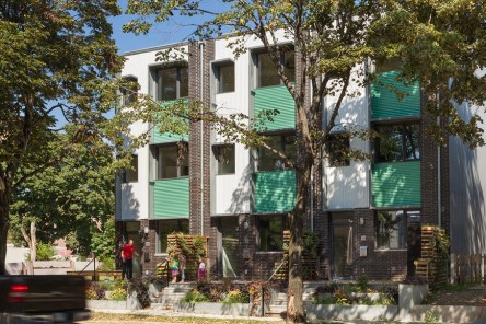
With the U.S. building sector accounting for 7% of global primary energy consumption, residential and commercial property developers are turning towards modern solutions, like Passive Homes, to increase energy efficiency in new and renovated properties. Big Apple Energy While it might be “the city that never sleeps,” it wouldn’t hurt to turn a light off once in a while! Though it’s probably no surprise to learn that many of New York city’s most expensive buildings aren’t particularly energy efficient, in truth the numbers are quite shocking: 70% of the city’s emissions are generated from New York City buildings. Even more eye opening…2% of those buildings account for more than half of the city’s energy use. According to the advocacy group Climate Works for All, ten of New York’s most expensive buildings score an “F” in terms of energy efficiency based on Energy Use Intensity. With several more luxury high rises and condominiums in the works, many property developers are looking for ways to lower the energy footprint of their buildings. One solution: Passive House Technologies. A Borough Apart As all things fashionable and hip, Brooklyn is the epicenter of New York City’s passive house movement. In fact, a majority of the New York’s 28 passive building projects are located in or around Brooklyn, including homes in Williamsburg, townhouses in Park Place, and condominiums in Prospect Heights. Some of the passive properties are new constructions projects, but many more are retrofits of existing structures, including a historic house in Brooklyn Heights whose classic façade remains unchanged, despite the addition of super insulation around its double-height windows. In all, Brooklyn is home to more than 20 residences and commercial buildings that fit the passive house guidelines, but because many property owners follow the standards without seeking...
New Kind of Cozy
My Micro NY
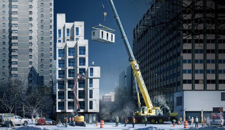
What can you get for less than 400 square feet? How about a gym, a roof terrace, stainless steel appliances and the chance to finally ditch the roommates and lay claim to your own slice of paradise. That’s the option currently being offered by Carmel Place, New York City’s first ever micro-unit development. Originally called, “My Micro NY,” this Lower East Side building includes 14 affordable housing units and is set to open in February of 2016. Sitting smack dab in the middle of Kips Bay, the newly christened Carmel Place will be New York’s tallest modular building. Winner of the 2012 adapt NYC competition, which strove to uncover a solution to the City’s housing problem, Carmel Place came about through a collaborative effort between Monadnock Development and the Lower East Side People’s Mutual Housing Association. The project’s designers, naArchitects, chose modular materials to reduce construction time, and a series of architectural flourishes make use of vertical spaces to create a sense of openness and light. Built in the Brooklyn Navy Yard and delivered by truck via the Manhattan Bridge, the nine-story Carmel Place apartments rise up on 333 East 27th street like a set of building blocks – gray in color, but multifaceted in the opportunities they promise to weary urban renters looking for a small space they can call their own. Each unit comes outfitted with kitchenettes, mini-fridges, and a two-burner/microwave combination in place of a stove. While the bathrooms are restricted to showers only – no claw foot tubs in this joint – all the apartments are wheelchair accessible. The designers made sure to incorporate large windows, Juliette balconies and 9.5ft windows to create a sense of openness and light. With hardwood floors and mostly white cabinetry, sample photos project a...
Ride to the Future
Cycling and multifamily
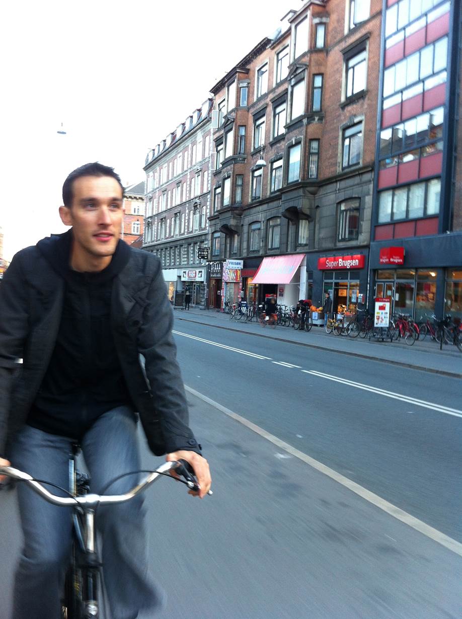
Amidst rising health care costs and the great urban rebound, the car is being replaced by alternative means of transport, such as biking. Millennials, one of the largest renter cohorts, are driving 23 percent less today than their peers did in 2001. According to U.S. Public Interest Research Group per capita driving rates have shrunken to 1996 levels. The American Public Transit Association found that Millennials’ preferred method of getting around is biking, while driving came in last, behind mass transit and walking. But on-the-go Millennials aren’t the only ones choosing two wheels instead of four. Between 2000 and 2011 the number of Americans getting to work mostly by bike grew by 47 percent, New Geography found. According to the latest National Household Travel Survey data the 60 to 79 demographic generated 37 percent of the nation’s increase in biking between 1995 and 2009. Moreover, between 2001 and 2011 the number of biking baby boomers doubled, according to Bicycle Retailer Industry Directory. So how does the growing popularity of biking fit into America’s communities and apartment industry? Zach Vanderkooy, PeopleforBikes’ Green Lane Project International Programs Manager, elaborates. What are the benefits of biking? Zach Vanderkooy: There are so many — it’s a low-cost, convenient way to get around for short trips, it reduces traffic congestion, adds economic vitality, provides access to fresh air, all while being a physical activity that’s built in to everyday life. Riding a bike is inherently joyful and practical. You don’t have to work too hard to sell that. Most importantly, biking offers a chance to explore and engage with a community at a more human scale. Much like people on foot, people on bikes activate a place with recognizable faces — every passing rider is a chance for a...
Purpose Cities
Urban Planning 2.0
What sets the blossoming Adelaide, Australia apart from the confines of Palmanova, Italy? It’s a question that many city designers face with a mix of fear and excitement. And with more purpose cities on the horizon, it’s a question better answered sooner than later. City planners may find the answers by taking a look into multifamily developments. Purpose-built cities, or planned cities, are cities constructed from the ground up to fulfill a distinct need. In the case of Brasilia, Brazil, planners selected the location to avoid maritime raids of the early 19th century. El Salvador, Chile, was built as a self-sustaining center for miners. Today’s purpose cities are more of a novelty in comparison. Designers envision futuristic utopias that provide a haven from carbon-riddled metropolises. Purpose cities and smart cities often merge, touting automated infrastructure and an inclination towards sustainability. Well organized, sustainable, with that new city scent—why aren’t the new purpose cities more popular? Why aren’t cities like Songdo and Lavasa bursting at the seams? Most planned cities are placed in uncharted territory, an effort to transform a desert into an oasis or a pristine wilderness into tame city streets. Far commutes from “civilization” don’t appeal to those who like to stay in touch with family and friends. Remote locations are also a tough sell for businesses, a headache for transportation coordinators, and a gamble for hospitality and entertainment leaders. Building on pristine, undeveloped lands certainly doesn’t bode well for environmentalists. Sustainability and sprawl are incongruent at best. A more suitable approach has been to build on reclaimed land or retrofit existing cities. Amsterdam 2.0 leads Europe in smart city retrofits and redesigns. Santiago is also etching its name of the world’s list of tech-savvy, earth-friendly existing cities. Of equal importance, all purpose cities...
Property Enhancement
Adding color and efficiency
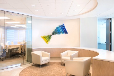
The real estate environment is in constant evolution, changing and adapting to accommodate the needs of a diversified pool of customers. To stay on top of the game, investors are constantly looking for the right mix of ingredients to ensure asset performance; more often, it’s a blend of creativity, sustainability and innovation that helps deliver the best results. Enhancing interiors through art. Parmenter Realty Partners, a real estate investment, management and development company headquartered in Miami, Florida, has found art as a most appropriate means to add color and appeal to their properties. With the help of two local artists and their inspiring creations, Parmenter aims to breathe new life into one of their most recent acquisitions in Dallas, Texas. The lobby of Rambler Park (pictured, right), a 14-story, 310,771-square-foot office building at 7557 Rambler Road, is now home to exquisite artwork installations by Mark Whitmarsh and Carlyn Ray. “When we acquired this beautiful building, the gallery-like lobby was missing some much needed color,” said Josh Hedderich, Asset Manager for Parmenter Realty Partners. “The addition of the work by artists as talented as Mark and Carlyn adds an upgraded dimension to the building, which we hope will delight and intrigue our tenants.” Three of Whitmarsh’s pieces are currently on display, including “Fall Thunder,” “Blue Odyssey,” and “Dream Sequence.” The artist is highly appreciated and admired for his abstract expressionistic use of color and creating high-energy vivid stories on the canvas. He has lived and painted in Dallas for more than 20 years. Carlyn Ray, a local glass blower and former Dale Chihuly understudy, has created a unique glass weave light sculpture that gives the building’s lobby a contemporary yet relaxing feel. During her two years as an employee for Chihuly, Ray was part of...
Eco-Conscious Architecture
Office architects embrace green design
A healthy office environment is what keeps a company strong. Many of the West Coast tech companies that have experienced tremendous growth in recent times have recognized the benefits of sustainable architecture and built their campuses around green principles, with an emphasis on creativity and fluid design. Major tech players of the modern world, including Google, Apple, Samsung Electronics or Nvidia, are currently working on super-sized office parks that feature avant-garde designs and cohesive work environments. While they are all incontestably unique in terms of architecture and design principles, there’s one recurring theme that brings them forth as stewards of the environment: particularly their focus on eco-consciousness and livability. Samsung is working with architecture firm NBBJ to develop their new American headquarters in Silicon Valley. The outfit’s design embraces new urban guidelines established by the City of San Jose which call for densification, active streetscapes, and environmental stewardship, as pointed out by NBBJ. The state-of-the-art campus will be anchored by a 10-story tower, enhanced by an amenity pavilion and an 8-story parking garage. An abundance of green space and recreational facilities will be integrated throughout the development with the precise intent to induce a state of relaxation for all employees and encourage interaction among company staff. With its imposing height and innovative form, the new HQs are aimed at creating a powerful brand image for Samsung. The tower is clad in white metal and clear glass, balanced to reduce solar heat gain. The podium is clad in warm terracotta hues and metals that are sympathetic to the traditional colors of San Jose. Besides promoting healthy lifestyles, green design acts as leverage when it comes to attracting and retaining the best and the brightest talent in the highly competitive tech market, which is growing at a faster rate than overall employment. Working out of a nurturing and supportive space is extremely stimulating for employees in the creative sector, and it becomes a real help in boosting office productivity. The office park will become home to 2,000 Samsung employees and will be divided into two sections: R&D and sales. A courtyard will connect the building together, creating a central gathering place to facilitate communication and collegial interaction. The intuitive design ensures that each Samsung employee is no further than one floor away from green space, which is something that you wouldn’t commonly see in most high-rise structures. Moreover, the property offers a wide range of amenities including fitness facilities, artwork, and cafes — some of which will be open to the public – making it easy for employees to bump into each other and share opinions. In addition to encouraging collaboration and innovation, the structure was envisioned as a staple of green engineering. Highly energy-efficient elements and eco-friendly materials have been incorporated throughout the building; for example, a rooftop solar array on the parking garage will provide renewable energy; the tower’s façade is designed to reduce solar heat gain, which reduces energy costs related to cooling a building; clear glass will allow natural light deep into the floorplate; and trees and water features provide connections to the environment. NBBJ identifies five trends impacting high-tech office design that any organization, big or small, high-tech or low-tech, can take advantage of to improve operational performance, employee wellbeing and talent recruitment: changing demographics, knowledge sharing, desire for wellness, digital meets physical and new architecture technologies. Learn more about each of these trends by clicking through the slideshow...
Life-Saving Furniture...
One Table, Many Uses
After seeing the haunting images of crumbled school buildings in Haiti, designer Arthur Brutter knew the focus of his upcoming academic project. He wanted to use design to save lives. Brutter, a student at the Bezalel Academy of Arts and Design in Jerusalem, teamed up with Professor Ido Bruno to tackle the true danger behind seismic events: falling debris. The EPA estimates that Americans spend about 90 percent of their time indoors. While that percentage varies throughout the world, the concept draws attention to the hazards surrounding our indoor environments. A collapsed roof or fallen wall becomes lethal. Ducking and covering under the average table won’t help much. Brutter buckled down to months of research. He sought to create a table design that would shield people from the dangers of falling debris yet was lightweight enough for youth to lift and carry it. Perhaps the biggest challenge, though, was to set the table at a price point where it could be feasibly used in both developed and developing nations whose school children are at the mercy of earthquakes. With those factors in mind, the building materials became just as important as its blueprint. The table could not be made of titanium or some rare biological matter embedded with Superman’s DNA. It had to be cheap, light, and durable. After months of planning and trials, Brutter and Bruno brought a prototype to the lab that could successfully withstand record-breaking impact while staying lightweight and cost effective. The end result is a wonderfully practical, marvelously plain little table. Award-winning designer Ron Arad served as the duo’s mentor, helping to finalize the design. “It’s not about doing a showstopper visually,” he says. “But doing a disaster stopper and it should be judged as this.” But the table...
Next Gen Design
Student-Inspired Ideas for Buildings + Cities
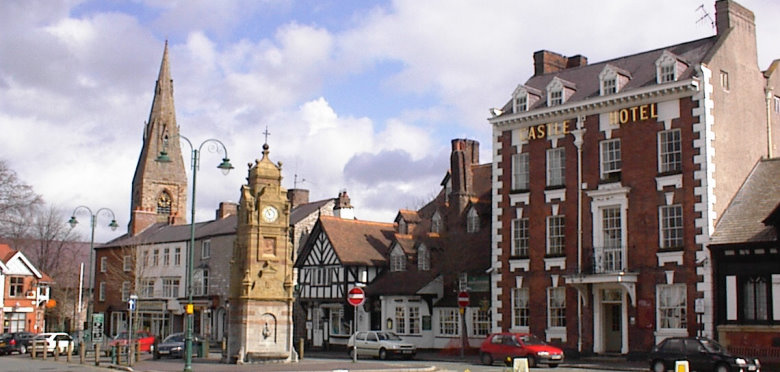
Commercial developers are seeking fresh new insights—and in some cases, designs—from the next generation of creative thinkers: students. Developers of small towns and established institutions are looking past architects and into the untested waters of university classrooms. Student-inspired development has become more common throughout the nation, with good reason. To many observers, American architecture had become stale, lacking the creativity seen in other leading nations. The high costs did not yield the cutting edge buildings developers yearned for. In response, educators across the US shifted their focus, intensifying emphasis on innovation and good, old-fashioned out-of-the-box thinking. As an indirect result, universities soon became the place to seek fresh insight at a very affordable price point. Youth has become a unique asset. Creativity flows unhindered by status quo or past disappointments. This generation has also been shaped by rapidly-changing technologies, boundless research opportunities, and an atmosphere that promotes sustainability and resourcefulness. Students have become the ideal inspiration for those who are looking to develop their business, institution, or city on a budget while tapping into the mindset of the future. Montana State University architecture students joined forces to help Big Horn County Historical Museum and Visitors Center recreate its image. Students created displays for the museum, designed a new logo, created murals, and organized a cross-referencing system that would make navigating the ground’s nearly 30 historic buildings more manageable. “The students inspired us to do so many things,” says Diana Scheidt, museum director. Interest in the museum has spiked, particularly due to the students’ model replica of Fort Custer which disappeared nearly a century ago. The young adults brought it back via plenty of research and a nifty 3D printer. School of Architecture students at the University of Notre Dame were called upon to help with future development plans for South Bend (left). South Bend leaders become interested in capitalizing on the group, hoping to reinvent the area as a retail and dining destination for students and visitors alike. To complete the project, the student team studied 11 successful college towns in the US before presenting ideas to community officials and residents. Proposals included the addition of mixed-used facilities with budget-friendly housing, more shops and cafes, and expanded roadways to promote pedestrian traffic and cycling. These projects would help link the isolated university to the nearby town, encouraging economic and social opportunities to flow in both directions. Jitin Kain, director of planning for South Bend, has announced that developments in the downtown area are already in progress. While university students can offer unique insights, the cost effectiveness of their services undoubtedly plays a role in their value. Student projects save cash. Tweaking an amateur project may prove to be more economically savvy than purchasing a design from an established firm. Mayor and trained architect Gavin Harris sought the help of students to create development and expansion plans for the town of Ruthin (right), located in North Wales. His decision was made two fold. Primarily, students are the visionaries of the future and he wanted to ensure that his town would appeal to future artisans and tourists. Secondly, student designs fit the town’s modest budget. “If we had not done it this way, we would never have been able to afford it. A private practice would charge £40,000-£50,000,” he said in an interview with BBC News. The student-led initiative cost less than £5,000. Urban SOS, a student competition sponsored by AECOM and hosted by American Institute of Architects NY, tackled resident issues this year. With the intent of vanquishing the slums, finalist teams focused on a suburb of Ciudad Juarez, the Kiberia neighborhood of Nairobi, and inner Bogotá. The Kiberia team won, taking home $5,000 as a grand prize. They were also awarded $25,000 toward making the project a reality. The neglected neighborhood certainly did not have the funds to propel its own renaissance. Through student award money and free project...

