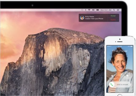
SAN FRANCISCO – The 2014 Apple keynote, delivered here earlier this month, revealed some incredible updates for iOS and OS X, due this fall when the accompanying hardware will be unveiled. The main theme this year is Continuity, which urges users to imagine how much better their digital life would be if the phone, tablet, and laptop all had the Apple logo. It’s now true that a superior operating system for laptop or smartphone performance is no longer sufficient. Apple is pushing the advantages of adopting a cohesive family of devices, hoping that current Apple users have no need to jump ship, and new converts are tempted to completely embrace the Apple culture. Why sell one device when you can sell two or three? With continuity, the user can seamlessly start a task on one of the Apple devices (the iPhone, for example) and pick right where he/she left off to finish it on another device (the Mac), simply by clicking an icon that automatically appears. An iPhone owner with a Windows PC or a Mac owner with an Android phone won’t be able to do this. OS X Yosemite & iOS 8 Since Continuity is the link between the two OSs, the majority of the updates apply to both. Actually, the latest version of OS X is reminiscent of last year’s iOS due to the attention spent on design. Flat design, translucent panels, no gradients, and textures of iOS 7 could be spotted throughout the new OS; app icons have flatter designs, the dock and windows have sharper corners, and a new system font was created for an improved readability. A “dark mode” that dims the entire interface was added to help focusing better while working – “clarity, but also utility”, as Senior...

