You know how the stereotype goes. “Older people don’t use technology.” “Smartphones are too complicated for seniors.” “A flyer or a phone call is the only option.” Reality, as it turns out, begs to differ. According to an AARP survey, over 90 percent of older adults use technology to stay connected. And among those surveyed, text messaging has overtaken email as the method of choice for communication — 86% say they regularly text with friends and family. Clearly, today’s seniors are on board the technology bandwagon. The question now is, are your senior living sales counselors on board as well? SMS text messaging for senior living marketing is not new, but it’s quickly growing in prominence as more and more providers recognize its effectiveness. Text messages have open rates as high as 98%, while emails hover around 20%. If you’re not texting your prospective residents, you’re missing real opportunities to connect. But before you dive in and start sending texts left and right, take note. There are laws in place that regulate what’s allowed, and some property management businesses have already landed themselves in hot water. What’s the law on SMS text messaging for marketing? The Telephone Consumer Protection Act protects people from unwanted communications from any business. That means service providers must receive prior express written consent before cold calling or texting. And they can’t make agreeing to receive these marketing messages a condition for moving in or otherwise purchasing services. So how do you stay on the right side of the law? How do you ensure you’ve gotten permission from your senior living prospects to send them marketing texts? SMS text messaging in Yardi Senior CRM Yardi Senior CRM helps senior living providers manage their entire sales and marketing process — including...
Mobile Branding Matters
Your Brand in Renters’ Hands
Take a guess. How much time do you spend on your phone every day? Add up all those downward glances, text replies, phone calls and photo filters. If you’re like the average American, you spend 5.4 hours on your smartphone. And if you’re like me, that’s way more than you expected. Those numbers come from a recent study asked 2,000 smartphone users to check their phone settings and report their screen time. Not only did the study reveal just how attached we all are to our devices, but it showed that usage across generations is similar. Millennials spend only a little bit more time on smartphones (5.7 hours) than baby boomers do (5 hours). Over 50 times a day, we’re checking our phones. This year, Gartner anticipates that there will be over 20 billion connected devices. Just imagine how much more dependent we’ll be as these tools continue to pervade our homes and habits. Smart devices have led to incredible innovations, and they’re changing our lives like very few other communication technologies have before. By far one of the biggest differences is the way we interact with businesses. Why grab your car keys or dial a support line when the services you want are available at your fingertips in a mobile app? We now spend about 90% of our smartphone time in apps. Remember, that’s hours of every day. So for businesses looking to stay competitive, your mobile presence has to be top-notch. Of course, that goes for multifamily businesses too. You’ve spent so much time and money defining your brand strategy and designing your physical properties. Shouldn’t your mobile apps match? Put your brand in the palm of your residents’ hands Your residents are on mobile, so you should be too. Take advantage of this opportunity to connect with residents in the channels they prefer. “But wait,” you might say. “What about our company website? Doesn’t that work on mobile too? Why do we need an app?” Mobile websites are a valuable resource, but they can’t do everything a native mobile app can. Your mobile website is most often a shrunken version of the desktop website, accessible only from a browser and unable to offer a unique user experience or leverage phone capabilities like GPS, cameras or notifications. To top it off, consumers simply prefer mobile apps – by a large margin. One report suggests up to 85% of people prefer apps over mobile sites. Why? Convenience, speed and ease of browsing. It’s not just a matter of preference either. Apps have shown practical results as well. The conversion rate for apps is more than three times higher than on mobile websites. And if the app is poorly designed, 55% of people say it’d put them off using a company’s products or services, and nearly as many would be less likely to recommend the company to others. Clearly, your mobile app experience matters. It’s why we’re excited to introduce MyCafé by RENTCafé. The new white label mobile app for residents helps you promote your brand on the devices they use every day. Build awareness for your business and offer residents the convenience they expect in an app you own. You can brand the look and feel of the entire experience: Pick an app name that renters recognize Select colors to reflect your brand Feature images of your own properties Upload an icon that stands out Customize menu options to fit your needs MyCafé has the same powerful and popular features that are built into our standard RentCafe Resident app. Your renters can submit maintenance requests, make online payments, reserve amenities, interact with neighbors and more, all from their smartphone. And your property managers have the ability to offer lease renewals and electronic signatures on the go, with push notifications to let residents know when action is needed. If your property already uses RENTCafé Resident, you won’t have to...
Samsung Unpacked
2018 Product Updates
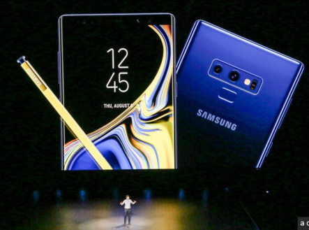
Samsung’s annual product conference gathered a big crowd in Brooklyn last week. The main focus was on productivity and performance upgrades across Samsung’s entire collection of devices. The most anticipated gadget was the company’s phablet, Galaxy Note 9. On the exterior, not much has changed, but under the hood some upgrades took place, including a bigger battery, an even bigger screen (6.4-inch) and a more potent S Pen. Additionally, Samsung’s DeX software is now built into the phone, which means that the phone now can be plugged into any external display for a desktop-like experience. Available in two configurations—a 128GB/6GB RAM model for $999, and a 512GB/8GB RAM for $1,250, the phone will start shipping later this month. Design wise, the rear fingerprint sensor was relocated below the camera, but everything else is still in its place: water resistance is still a feature, as is fast wireless charging, expandable microSD storage, the Bixby button and the mighty headphone jack. What’s most baffling about this device is the storage capacity—add a 512GB microSD card into a 512GB Note 9 and you’ll have 1TB of storage and that is pretty insane. Galaxy Note 9 will run on Android 8.1 Oreo without any changes from the user experience on previous phone versions. The battery, a hot topic in Samsung’s world, has been increased to 4,000mAh, the largest so far in a Note. To keep their customers’ cool related to battery safety, Samsung has validated and certified its new batch of batteries through outside companies as well as in house. The heart of the Note 9 is a Qualcomm Snapdragon 845 processor with new optimization to the GPU. A pretty cool feature we still don’t know too much about is the Water Carbon Cooling system, but it sounds...
Apple WWDC 2018
Software Steals the Show
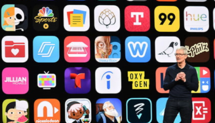
This year’s Apple WWDC keynote, held at the San Jose McEnergy Convention Center in San Jose, was a big surprise for many, not for what it showcased, but for what it didn’t—hardware. Even though the event is clearly about software, Apple has gotten us used to announcements of future or refreshes of current products. But this year’s session was all about a large variety of enhancements to its iOS, tvOS, watchOS and MacOS platforms, designed to further optimize the overall Apple experience. News on hardware will reportedly be announced in September. iOS improvements include faster speeds and enhanced responsiveness for the iPhone. This even applies to the older versions, like the 6S, which the company claims will fire up 50 percent faster than previously with its camera will be ready to snap photos 70 percent faster than before. iOS 12 should work just fine on all devices capable of running iOS 11, including the little 5S. This was pleasant news for those hanging on to older phones. Maybe the nicest touch added to the operating system is Screen Time, which could help curb smartphone overuse. New usage reports will show how you’re wasting your time and, should you want to, you can set limits for those apps that eat up too much of your time. Grouped notifications are an attempt to cut distractions, and parents will be able to limit their child’s screen time. For many, this announcement was bizarre as it is unheard of to have a company use one of its biggest annual events to showcase ways to use its products less. But the reality is that Apple doesn’t make money from the time people spend on its devices, it just needs as many people as possible to buy those devices. If...
Xiaomi Mi Mix 2S
Takes on iPhone X
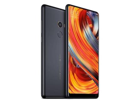
Imitation is the sincerest form of flattery, they say, but I doubt Apple is pleased with the compliment Xiaomi has been paying since it launched its first smartphone back in 2011. Since then, the little rice (Xiaomi’s translation from Mandarin) grew into a solid 12.4 percent market share in China’s smartphone market. Chances are its growth will be boosted this year, with the help of the recently launched Xiaomi Mi Mix 2S. This Android-powered Apple-looking device is the company’s latest flagship smartphone. Design-wise, the Mi Mix 2S didn’t change from the version launched about half a year ago, and it’s understandable as it holds several design awards. The change happened under the hood, as it more often should. Back to the design features, the device looks exactly the same as its predecessor when regarded from the front—the 6-inch, full HD plus LCD display with 18:9 ratio and 1080p resolution and trim bezels on the side and top is unchanged, as is the 5-megapixel front camera, still placed in that awkward position at the bottom right corner of the device. The fingerprint sensor is still placed on the back. Mi Mix 2S is also made of ceramic with aluminum, but the company is interested in producing a full-ceramic edition, just as it did with the previous version; the color-scheme is minimal: black with gold trim and white with silver trim. On the back, there’s another story: the new dual-camera system replaced the single module and has been moved to the top left corner, mirroring iPhone X’s design. The camera system consists of two 12-megapixel sensors—one behind the wide-angle lens and the other behind a telephoto lens. The system features dual-pixel autofocus, four-axis optical image stabilization and Sony’s IMKX363 sensor with an F/1.8 aperture and 1.4-micron...
For App Addicts
Light Phone 2 may help
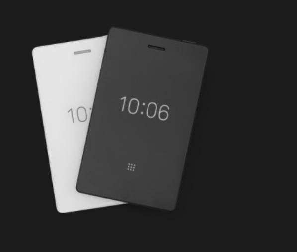
Your smartphone is the one thing you carry on you at all times. It has become an omnipresent device, with very few places where one’s not allowed to have it. It helps a great deal, but it’s ever more damaging as well. Today we face something that’s called ‘app addiction’ and there are more and more studies showing the damaging effects apps have on our brains. Analytics company Flurry released some data that shows that people in the U.S. use their mobile devices for five hours a day. More so, the tech-support firm Asurion found that Americans check their phones 80 times a day on average. Even more so, you’ve surely heard that Silicon Valley parents (from the ranks of those who built these apps and devices) are raising their kids to be tech-free. One Brooklyn-based company has proposed an alternative to the tech monopolies back in 2015 and now they’ve returned with a second model—Light Phone 2 is everything a smartphone isn’t, an intentionally limited gadget. The device is a 4G LTE phone with a black and white matte E-ink display and only a few features extra compared to an old school landline: it can send and receive messages, set up an alarm clock, and maybe it will be able to calculate a ride home and perhaps even listen to your favorite playlist. It can also store a decent contact list, too. That’s it—no social network tools, ads, email, games, or whatever else to distract you from the reality of life. Joe Hollier and Kai Tang, the company’s founders, came up with the idea while at a Google incubator where they were asked to design smartphone apps. They did… the opposite. The world already had too many addicting apps, it was time to...
Lamborghini’s Phone...
Alpha One is Italian Luxury
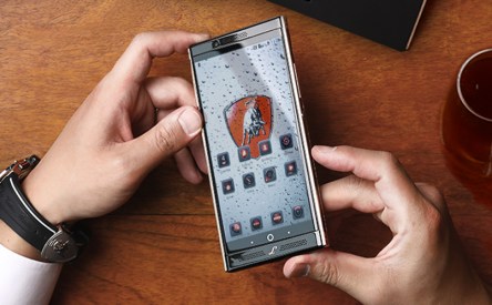
These days, most of us own a smartphone or even several. Smartphone manufacturers have also worked their best to bring near premium design and specs to budget devices. Yet, every now and then, the industry surfaces some device with a ridiculous price boasting marketing names such as “the most luxurious technology” and you’re just wondering who on this planet would buy it and most importantly, why. The latest—Lamborghini Alpha One—can be yours for $2,450. It’s sort of obvious that a smartphone delivered by a luxury carmaker like Lamborghini will undoubtedly come with a premium price, but is it really worth the money? The Android device features a “liquid metal” frame, “Italian handmade black leather” and the company’s ‘Raging Bull’ logo, the symbol of “strength, courage, determination and boldness.” The liquid metal is used in the device’s side frame and it’s basically an alloy often used in supercars, premium golf clubs and surgery tools thanks to its high strength, corrosion resistance, light weight (still, the device weighs 200 grams, above the 188 grams of the iPhone 7 Plus) and malleability. But this is where the premium features stop. The ‘supersmartphone’s feature set is not as impressive as its luxurious exterior: a 5.5-inch WQHD, 2560×1440 display with Gorilla protection, powered by a two-year old Qualcomm Snapdragon 820 processor and 4GB of RAM with 64GB of storage, expandable up to 128GB. (Note: there are already on the market devices with 256GB capacity.) The Alpha One runs on Android Nougat and sees through a 20-megapixel rear-facing camera with f/1.8 aperture and an 8-megapixel front-facing camera with f/2.2 aperture, 4K video recording, optical image stabilizer and electronic image stabilization. It also offers dual SIM support. The Italian device features a DOLBY ATMOS dual-speaker 3D acoustics system optimized for mobile...
New from Google
Hardware Focus
Earlier this month, Google launched eight new hardware products — two versions of the Pixel 2, a new Daydream VR headset, two new Google Home speakers, an AI camera dubbed Google Clips, AI-enhanced headphones called Pixel Buds and the Pixelbook laptop. The second-generation family of consumer hardware products seems an effort to make up for the lost time in the hardware department. Google’s senior vice president of hardware, Rick Osterloh, reminded everyone at the launch that while late to the race, Google could still be a contender. After all, Apple was not first to market with MP3 players and smartphones, nor was Facebook the gate-clanging social network. Pixel 2 & 2XL Following last year’s Pixel, Google launched two new smartphones—Pixel 2 made by HTC and Pixel 2XL made by LG. The phones boast an overall score of 98 points in camera benchmark charts, surpassing every other smartphone currently on the market. Google managed to score higher with a single camera when competitors have done so with two. Google has also added the live photo and portrait modes, two of the features iPhone users have been playing with for awhile. Both phones are made of metal instead of glass or plastic, but for this premium look and feel the company had to ditch wireless charging. It does support wireless communication though, thanks to a glass window at the top of the phone. The headphone jack is missing on both models. Both devices run Android 8.0 (Oreo) with some custom software and features from Google. They’re water resistant and are powered by Snapdragon 835 processors with 4GB of RAM and storage of 64GB and 128GB. Connectivity-wise the devices support Bluetooth 5.0 + LE and have an USB-C port to be used with the headphones (there’s also...
Apple Update
Refinement, Not Revolution
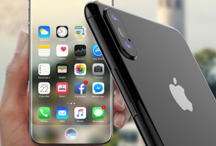
Come autumn, the world stops to see the next Apple crop. In this case, we mean tech, not fruit! This year has been especially bountiful with the launch of an upgraded Apple Watch, new iPhones, the 10-year celebration of the iPhone and the first keynote to be hosted at the company’s spaceship headquarters in the Steve Jobs Theater. Apple Watch Series 3 Even though the star of the evening was the iPhone X, some other interesting stuff occurred on stage. For example, we met the Apple Watch Series 3, Apple’s newest wearable version, upgraded to LTE connectivity—basically, the watch now works as a standalone device, so you don’t have to keep it connected to your iPhone. If you already own an iPhone and don’t have a watch, this should be the next item in your Apple shopping bag. The gizmo will work with the same phone number that your iPhone has, synchronizing calls, iMessage and music automatically. It will use a separate connection when away from the phone, so you no longer have to carry both your watch and your iPhone next time you hop on your mountain bike or head out for a jog. Visually, not much has changed. The device itself is slightly thicker than the Series 2 model, but that’s to be expected considering the performance upgrades it has stored inside. The Watch Series 3 is decked out with some new band options too—the Sport Loop, designed for outdoor active situations, and Hermès leather straps. Technical specs of the new watch include a new dual-core processor with 70 percent better performance and a new W2 chip that boosts Bluetooth, wireless connectivity and power efficiency. The cellular antenna is the display itself, and there is a tiny electronic SIM card inside for...
A Smarter Vacation?
Google Trips App
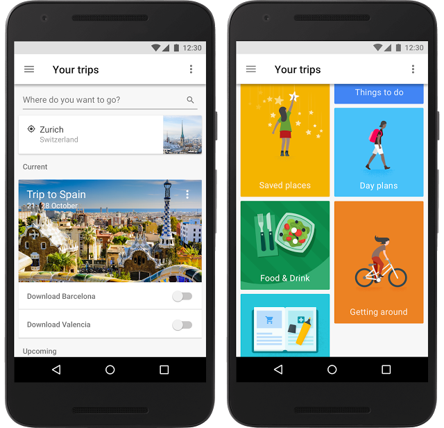
A lot of work goes into planning a vacation these days. From airline and bus tickets to hotel reservations, you’re making a lot of plans and getting a lot of emails. It can be hard to find what you need when you’re in a hurry on the road. The Google Trips App is a travel guide and a smart vacation planner that was launched last year. Recently upgraded, it helps travelers experience more and organize less. Available both on Android and iOS, the free app compiles all your essential info in one place and makes it available even offline. How it works Once you download it, you need to login using your Gmail account. In just a few minutes, it scans your email, pulling up all trip-related information from your inbox—hotel receipts, car reservations, maps, flight confirmations etc. The best part of the app is that it also works offline. Once you’ve downloaded everything onto your phone, you have access to all the necessary info no matter where you are so you don’t have to use an expensive international data plan. After signing in, the app will show you a list of upcoming and already completed trips. Tap into a future trip and discover a colorful grid with these options: Reservations This feature organizes your flights, hotel information and any rental car reservations you may have made. It puts all your reservations in one place. If you click on an upcoming flight, for example, it gives you the times plus the terminal and gate as available. For hotels and hostels, Trips also shows a map. Things to do This section is the heart of the app. It compiles user data and reviews to offer you a list of things to see in a city...
Meet Pixel
Google's First Phone
Google has finally launched its own smartphone, the Pixel, and aimed it directly at Apple. The search giant is keen on showing what a premium Android can do when the hardware is tailored to the software by those who actually make it. Following the Nexus line, Pixel is now 100 percent Google, and even though HTC is the firm that has actually built the device, Google has made all the decisions on what goes into it and how it operates. The smartphone joins the Pixel C Android tablet and Chromebook Pixel as Google’s first in-house devices. Pixel shows off an all-metal body with an all-glass display, fingerprint scanner on the back and headphone socket, but lacks the waterproof feature. It brings a slightly different look with its glass panel covering the top third of the back and the wedge-shape, thicker at the top where the camera is placed. Its curved edges and flat sides make it easy to grip and surprisingly at first, the wedge shape gives it good weight distribution. At the bottom lies the USB-C port flanked by two grilles—one is a speaker and the other is hiding the microphone. It comes in three colors—Quite Black, Very Silver and Really Blue; the last one is a limited-edition option and Google still has to reveal how one can get hold of it. The smartphone exposes its abilities through a 5-inch full HD AMOLED screen on the front that’s crisp and vibrant, with rich blacks and pretty good viewing angles. Moreover, the device is Daydream VR-ready, which means it supports Google’s new virtual reality platform. However, for some, the excitement over this feature is somewhat shadowed by the fact that the display isn’t optimal for VR. Pixel is one of the first handsets to...
Nubia Z11
Smartphone Review
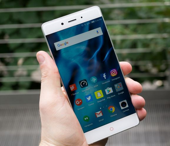
Not many heard of the Chinese smartphone brand Nubia, but after the company’s latest flagship release at IFA Berlin, many will, even more so now that Nubia announced that Z11 will be available internationally starting with September. The 5.5-inch device attracts attention firstly through its bezel-less design which gives an 81 percent screen-to-body ratio, which besides creating a beautiful seamless effect, makes the 1080 display easier to manage in one hand. And, even though unexpected, the display is of the Full HD variety. It is not the first smartphone of the kind, but it’s a feature that appeals to many. This was doable through RC 2.0 technology, which bends light through the 2.5D Arc Edge Corning Gorilla Glass to make the display seem wider and conceal the side bezels. Z11’s metal frame is made of light and durable 6,000 series Aluminum Alloy, but between the screen’s glass and metal frame there is a buffering layer that protects the phone against accidental drop damage. Overall, the smartphone sports a very posh look, especially with its black gold version (Z11 will be available in three versions, including the more common gray and silver models). But the difference is packed inside its 7.5mm (0.3 inch) slim body—a Snapdragon 820 processor, Adreno 530 image processor, 4GB or 6GB of RAM (the difference will be mirrored in the price), 64GB of internal storage expandable to up to 200GB through a microSD slot, a solid non-removable Li-ion Polymer 3000mAh battery, an 8MP front camera and fingerprint scanner on the back. The fingerprint scanner doubles as shortcut key for taking regular and scrollable screenshots, as well as for recording the screen. Performance wise, the device runs Android 6.0 Marshmallow with Nubia’s custom skin on top (NewPower 2.0), optimized to increase power...
OnePlus 3
Android with OxygenOS
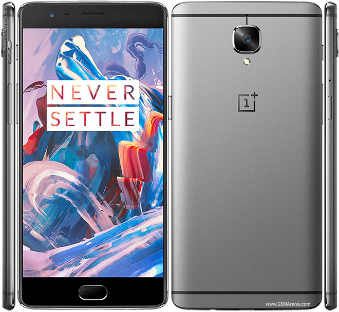
OnePlus is no longer a new name on the market. The Chinese manufacturer premiered in 2014 with its first handset, followed up by last year’s OnePlus 2 and the even more budget-friendly OnePlus X. Now OnePlus 3 takes the center stage and so far, the premise is better than before—Oppo dropped the invitation system so that everyone can use their money to purchase it. Design OnePlus 3 doesn’t look bad with its curves and contours. It’s a grown-up, solid device that comes in an elegant aluminum unibody—a great and durable upgrade over the plastic-clad and glass-backed precursor versions. The design doesn’t bring anything new or original per se, in fact, the body looks a lot like that of an HTC phone. The only inelegant feature of the device is the raised camera lens, but it doesn’t damage too badly the overall design. The home button doubles as a fingerprint reader, something we’re seeing more and more now that Android Marshmallow included native support for them. There is no water resistance or some other protection from the elements, if in case you were wondering. A somewhat bizarre feature is the three-position notification switch on the side. It corresponds to the three modes of Android’s notifications: silent, priority-only and all notifications. The switch seems to be the only way to change notification modes on the OnePlus 3 (there is no software method), thus making it a “hard lock” into whatever mode the user chooses. The back plate cannot be swapped as with the OnePlus 2; if you’re interested in changing the way your phone presents itself, you can order official slim cases from OnePlus—bamboo, black apricot, carbon fiber and rosewood are among those available. Hardware What puts OnePlus 3 in the spotlight though is not the...
Furniture with Charge
Integrating technology to living
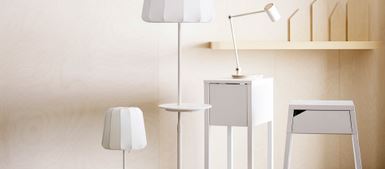
In today’s world, our homes, desks, cars, are filled with cables, adapters, outlets and battery packs designed for our ever increasing number of smartphones, wearable tech and, of course, the Internet of Things. Some have noticed the opportunity and began exploring a new industry that’s expected to boom in the next few years—the wireless charging indus try or inductive charging. An innovative way this is playing out is wireless charging furniture. Wireless Charging Collection from Ikea Last spring, Ikea decided it’s time to untangle the web so it launched its line of wireless charging furniture; that was a moment when a future of effortless device-charging seemed reachable, even though all those lamps and side tables would still need to be plugged in or that some phones, including iPhones, need a special case in order to pair with the Qi wireless charging technology built into the furniture pieces. “With the help of our wireless chargers, we make charging easy, fun and convenient, by turning furniture into charging spots. We enable convenient charging throughout the home, designed for your personal needs. At the same time, we make homes more beautiful by minimizing the use of cords. Nobody likes cords, yet everyone wants a fully functional home. With our wireless chargers, it’s possible to have both,” said Björn Block, IKEA range manager for lighting and wireless charging at the launch of their wireless charging collection. The collection has items that range from $9.99 (the Romma cord management box) to $119 (the VARV floor lamp). It’s simple, minimalist and very Ikea; it consists of charging pads, desk lamps, bedside tables and a special pad that users can install in any piece of wood furniture they already own (and don’t mind doing the drilling themselves). The charging pads are basically a cross in the middle of a circle that’s about two inches in diameter that use the Qi wireless standard. The majority of phone manufacturers support the Qi standard with the notable exception of Apple. Thus, for iPhones, Ikea came up with the Vitahult cases which include a Qi adaptor. It’s a bulky, unflattering case that feels as if it’s made of the same cheap plastic, but it gets the work done. On the other hand, the lamps and pads are actually quite good-looking. Bottom line: if your phone support Qi wireless charging and you like Ikea’s collection, go for it. If you’re an iPhone owner, you might want to wait for a better option. Curvilux Smart Furniture Argentina-based Curvilux recently launched its first product on Indiegogo—the Curvilux nightstand. It’s a clean-lined piece of furniture that features not only the built-in wireless charging and USB ports, but also boasts integrated speakers, two programmable lighting systems, motion and temperature sensors, smart home integration capabilities and a drawer you can unlock with your phone. It comes with an app that enables users to program lighting to set up a simulated sunrise alarm clock. Moreover, it can charge up to three devices at once through the wireless and USB chargers incorporated. The $50,000 crowdfunding campaign has been successful and met the funding goal which means that the nightstands will begin shipping in November 2016. FurniQi from Fonesalesman The London-based company specializes in standalone wireless charging pads, but it’s also developing FurniQi, a line of simple furniture pieces with built-in Qi wireless charging technology. The first in the range is a side table made of Mao Zhu Bamboo. The design is simple, with just a ring on the surface to indicate where the device should be placed to charge. “Marking our entry into the world of furniture, we have put a lot of thought into the table’s design and usability,” Bavan Palasanthiran, founder of Fonesalesman, said in a press release. “The FurniQi side table is incredibly easy to assemble taking a mere 60 seconds from opening up the box to having a complete table ready to charge your...
CoalBit
Portable Power Bank
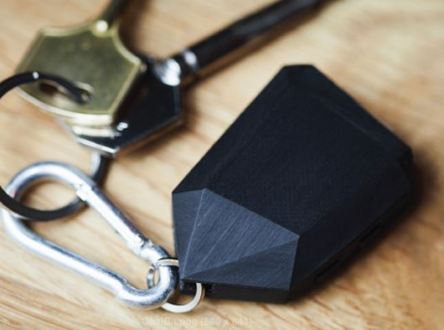
Power banks are no longer an innovation, but a Latvia-based firm designed a new device it hopes will differentiate itself from the rest. Draugiem Grupa came up with CoalBit, a 23-gram, 2×1.4-inch coal-shaped portable power bank which features a 560mAh battery, enough to juice your smartphone with three hours of talk-time, two hours of surfing the Internet, or listening to 10 hours of music. And this is not all. CoalBit includes a flashlight, in case you need one handy. But the novelty that makes the Latvian device differentiate itself from the rest comes from the inclusion of a Bluetooth locator which enables it to sync with any smartphone. By syncing it with the phone you can keep track of both your phone and whatever you attach to your CoalBit. Due to its small size, misplacing it is easy (as is your smartphone). The developers thought about it and found a solution: you can enable a distance alert that will buzz your phone when you get a little too far away from the tiny power bank. In the event you’ve lost it somewhere and haven’t enabled the feature, the firm built an app, available on iOS and Android platforms, which will inform you of the CoalBit’s last known location. Furthermore, in case of emergency you can send an SOS signal to your friends and family. Pretty cool feature, no? Like what you’re reading? Draugiem launched a Kickstarter campaign that you can back, aiming to reach an $84,000 funding goal that will enable them to finish development and begin production. The firm offers two versions of the product—the basic one, CoalBit Lite which removes the Bluetooth locator, and the regular one, CoalBit Standard, with all the features described above. In addition, CoalBit comes with either an...
iPhone SE
A little phone that can
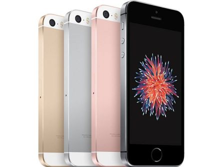
Aside from the ongoing battle with the Department of Justice and its commitment to customer data privacy, Apple found one hour in March to introduce a few springy updates—a new iPhone, new iPad, news on the Apple Watch, Apple TV and CarPlay, and a new iOS version. The world today has smartphones that come in two sizes—big and huge. It is hard to turn to smaller devices after going big. Yet, the new iPhone SE seems to be the first one made for those with thumbs lacking the wingspan of albatrosses. As the company said, “this light and compact phone is designed to fit comfortably in your hand”. Steve Jobs’ words come to mind regarding phones and how they should match the ergonomics of your hand. In 2010, as competitors were selling larger devices, he mocked a big phone: “You can’t get your hand around it… No one’s going to buy that.” But in 2014 Apple changed its mind and released iPhones with 4.7 inches and 5.5 inches, up from 4 inches for older models such as the iPhone 5 and 5S. Yet more than 30 million consumers bought the older four-inch iPhones last year, according to the company. “Some people even pleaded with us to please keep the four-inch products,” said Greg Joswiak. Apple made now another U-turn with this new 4-inch phone (was Steve Jobs right after all?) The iPhone SE will be released on March 31. It has the style of iPhone 5S released in 2013 (adding the new rose gold color), but the inside hides most of the upgrades launched with the iPhone 6S released in 2015. Yes, only most of them. The iPhone SE comes equipped with the same powerful 64-bit A9 processor as the 6S, which makes it...
A Sixth Sense
Cat S60 Smartphone
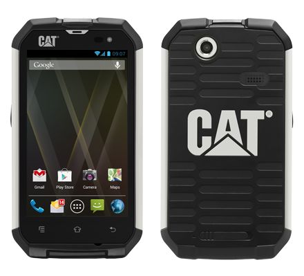
Did you know that Cat® sells phones and smartphones? A new version of smartphone was introduced at the Mobile World Congress in Barcelona last month. The Cat S60 is the company’s new flagship product, the world’s first smartphone with integrated thermal camera, once a very expensive tool used only by law enforcement and the military. Initially, the FLIR ONE thermal camera begun life as a cumbersome case for the iPhone 5, then turned into a dongle that connected to the microUSB or Apple Lightning port. In the new smartphone though, the Lepton sensor that enable FLIR cameras to see in darkness has been integrated into the device itself, next to its standard rear camera. “To stand out from the crowd in today’s smartphone market requires true innovation and we are proud to partner with FLIR to announce what is truly a world’s first,” said Peter Stephens, CEO Bullitt Group, global mobile device licensee for Caterpillar. “The Cat S60 represents a milestone for smartphones. We are excited for thermal technology to be in the hands of Cat phones customers and to discover the myriad of daily time and efficiency use cases it will present for them.” A sixth sense “We are delighted to work on the latest Cat phone with Bullitt Group, to integrate our thermal camera into their proven, industrialized smartphone to create a truly innovative and groundbreaking mobile product,” said Andy Teich, President and CEO of FLIR. “The CAT S60 presents mobile users around the world with new capabilities – a ‘sixth sense’ experience that only thermal imaging can offer.” Cat S60 is also waterproof to depths of up to 5 meters for one hour, during which time it can be used as an underwater camera, pushing the boundaries of mobile technology. The...
Best iPhone Cases
Protect Your Phone
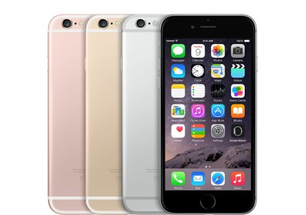
Many of us purchased (or were gifted) new smartphones. Many with new smartphones have the new iPhone 6S or iPhone 6S Plus. Like the iPhone 6, the newer version can be a little slippery – it’s rather thin and without sharp edges. Now it’s time to find suitable protection for it, as no one wants to experience that uh-oh moment when your iPhone slips out of your hand and goes falling to the hard floor. Smart Battery Case Apple Silk Innovation PureView Case with Customizable-Backpanel Pong Sleek Case Leather Wallet Case Incipio Feather Shine Incipio Edge Chrome Casetify Acme Charge Case Alto Case Radius v2 Tech Armor Active Series We’ve made a list of the top choices. Any favorites that are left off? Incipio Feather Shine is a sophisticated case made of rigid ABS polycarbonate frame with a premium brushed aluminum style finish. It protects the device against dents and scratches while looking dashing. It’s available in six colors on Incipio’s website. Incipio Edge Chrome mixes durable protection with fashionable flair. Its frame is made of Plextonium™ polycarbonate that covers all edges. Moreover, the case is comprised of two-piece sliding design for docking and device removal. Silk Innovation PureView Case is an ultra slim protective case against drops, dings, and scratches. It combines a sleek, shock-absorbent rubber bumper with a crystal clear polycarbonate back shell. Users can personalize it through customizable inserts that fit behind the clear back shell. Casetify also allows its customers to turn their photos into a case, besides the designer collection. Radius v2 looks like a stripped down bumper with snap-on convenience that protects the corners and rear of the iPhone, the areas most susceptible to damage when dropped. This minimal design makes Radius v2 extremely light. Color options include...
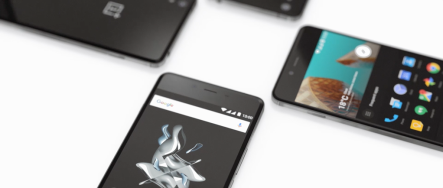
OnePlus X
Enhanced X Experiment
China’s OnePlus has been enjoying the spotlight since the OnePlus One smartphone debuted more than a year ago. The handset surprised and impressed with its hard-to-refuse price point: a top-end phone is rarely under $300. A year later, OnePlus did it again with its follow-up OnePlus 2, improving the technology, but keeping the price relatively low. Now comes version No. 3. OnePlus X is a completely different species—it’s OnePlus’ first truly mid-range smartphone that feels like it should be $500, but costs only $249. “The X line will always be the line where we can experiment a bit more.” The X line trades a bit of power, battery life and even screen size for a design that feels comfortable and looks premium. OnePlus X will be available in two versions: Onyx and Ceramic. The latter is the premium model of the two, made using a laborious crafting process that takes 25 days. It all begins with a zirconia mold fire-baked up to 1,482oC for more than 28 hours. The next two days it is left to cool and then sent through a rigorous polishing process. OnePlus is making only 10,000 of them starting at about $414, and only for European customers. The device resembles the famous boxy design of the iPhone 4 with some modern traits. At 0.27 inches it’s the thinnest OnePlus handset so far and the 5-inch display sits comfortably in the palm of the hand. The device has micro cuts in the metal frame that runs around its circumference, adding to the grip. This time, OnePlus uses a 5-inch AMOLED display with 1080 x 1920 resolution with 441ppi, instead of an LCD one. On paper, this suggests that the device will display deeper blacks and more vibrant colors. A bit of...
Nexus 6P
New Google Phone
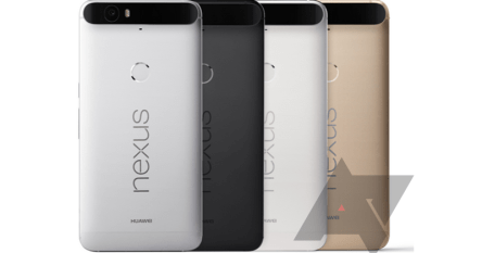
Google’s handset family welcomed a sibling that’s first of its kind: first one made of metal, first one made by Huawei, and the first one to include fingerprint reader and Android 6.0 known as Marshmallow. Nexus 6P is the new 5.7-inch device compatible with all major carriers, besides Google’s own unique Google-Fi wireless service that allows the user to transition between carriers without swapping hardware. The “P” in the name stands for Premium—due to its metal unibody design that’s placing it in direct competition with the aluminum iPhone 6S Plus and glass-and-metal infused Samsung Galaxy Note 5. It’s relieving to see how Huawei built the 6P to look and feel different than any other Google-commissioned phone—ditching the cheap plastic in the Nexus 5X (built by LG) for the metal design. At 5.27 x 3.06 x 0.28 inches, the device is slightly taller than Nexus 6, but notably narrower and thinner. Furthermore, even though Huawei raised the bar on the phone’s specs, Nexus 6P weighs only 6.27 ounces; the way they’ve fit everything in though is another story—the 12.3MP camera creates an unsightly-looking rear bulge with a black strip where the lens, flash, and an array of antennae are positioned; luckily this seems to be the only eyesore aspect of the device. On the bottom of the phone sits a reversible USB-C port, replacing the micro USB in favor of faster charging. A 3.5mm headphone jack sits at the top and the stereo speakers are now placed to the front. Nexus 6P has an AMOLED display with 2,560 x 1,440 resolution at 518ppi, looking brighter and more colorful than the previous Nexus 6, but also extremely saturated. On the exterior, Nexus 6P comes in the traditional white, silver and black. The 12MP camera shoots sharp,...
RoBoHoN
Adorable Robot Smartphone
Have you ever imagined a smartphone shaped differently than… a smartphone? I never thought I would appreciate a phone that rids of the ever-growing rectangular shape. But I do! In fact, it’s almost impossible to watch the video below and not wish to have a bipedal robot phone yourself. Sharp Corp. of Osaka, known as a brand-name for announced at the recent Ceatec technology show on the outskirts of Tokyo it would introduce a new mobile communication device in 2016 that is a tiny android robot—an android smartphone, literally. Its name is RoBoHoN and it was designed by renowned robot creator Tomotaka Takahashi. RoBoHoN is an adorable eight-inch-high robot with a 2-inch screen on the back, a camera and projector built into its face, and articulated animated arms and legs. It talks, walks, dances, and connects to LTE. Moreover, it’s capable of identifying people by their face or voice and will communicate verbally with its owner—it understands voice commands, will announce when there is a new message, and will also tell them to smile for the camera—a cute replacement for the selfie stick. There’s more to the little fellow than just that cute face. The device runs on a version of the Android mobile system (probably Lollipop), although it is not decided if it will use it going further or another operating system. It weighs a little under a pound and is small enough to be carried in chest pockets. According to the company’s statement, because of its form and the ability to naturally communicate with its owner, users should be able to feel a special bond with the device. Its main board is kitted out with 3G, LTE and Wi-Fi radios. Its core is made of a quad-core Qualcomm MSM 8926 clocked at...
Apple’s Fall Crop
iPhone 6S, iPad Pro, TV and more
Apple’s annual fall product preview featured a colorful array of unprecedented announcements kept 6,000 in-person attendees and thousands more online viewers interested for more for almost two hours. “To wear it is to love it.” Everyone knew there would be a new pair of iPhones—the iPhone 6S and 6S Plus—but this is not how the evening started. First came the Apple Watch, now best buddy with high-end fashion house Hermès, in an entirely new collection that features hand-stitched leather straps and a special watch face. The couture device will have a selection of three bands with the stainless steel face: a single leather loop, a double loop, and a cuff. The double loop one comes only with the 38mm face, while the thicker cuff only has the 42mm version. The band leather is available in different colors. Apple also announced new gold and rose gold colors for the Apple Watch Sport, a take on the pricey Apple Watch Edition series, but in anodized aluminum. Moreover, an expanded range of pastel Sport Band colors were presented under the fall collection. This can only mean that more colors are in the works for next year. Starting September 16, the wearable software will be updated to Watch OS 2, providing support for native third-party apps named “third-party complications” that bring notification and other third-party app data on to watch faces, as well as some overall performance improvements. More on that when it’s out. “Thin. Light. Epic.” Then there was the iPad Pro. This (not so) little (anymore) device grew up into a fabulous 12.9-inch screen, with plenty of surprises. Very comfortable for gaming, entertainment, and serious work tool, the new iPad is accessorized with a full-size keyboard and a multi-tasking tool. And if you thought that MacBook...
Sony Xperia Z5
Fancy 4K Display
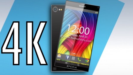
QuadHD displays are yesterday’s hot thing. The new point of attraction is 4K. At IFA 2015, Sony introduced its Z5 family—Z5, Z5 Compact, and Z5 Premium phones—with Z5 Premium sporting the world’s first 5.5-inch 4K (3,840×2,160) with 806ppi display, “next-generation” cameras, and some teensy-weensy fingerprint scanners. This is the first time ever that Sony has launched a trio of phones at the same time. They all share many features, but there is one thing that differentiates the Premium from the rest. The 4K display is a truly ridiculous world-beating panel, with vibrant colors and deep blacks. Unfortunately, the new screen tech was saved only for the Premium, while Z5 stays with the 5.2-inch 1080p unit and the Z5 Compact gets only a 4.6-inch 720p display. Aside from the 4K monster, the Z5 Premium flaunts a mirrored glass back in black, gold, and chrome. Z5 comes in white, black, gold, and subdued green with a frosted glass back, and Z5 Compact seems to be designed for the younger customer base, dressed in white, black, but also yellow and coral; these too with frosted glass at the back. If you’re picky about the size of the device you’re choosing for yourself, you’re in luck: Z5 Premium has 5.5-inch display and is 7.8mm thick, the Z5 has a 5.2-inch display and is 7.3mm thick, and the Compact has a 4.6-inch display and is 8.3mm thick. What’s your size? Specs-wise, the trio shares pretty much the same features. All three have inside Qualcomm’s Snapdragon 810 processor, up to 32GB of internal storage (expandable to 128GB by microSD), high-res audio chips, “up to two-day battery life,” and a fingerprint sensor built into the power button on the right edge of the phone, a position that feels more natural than...
Samsung Unpacked
Galaxy Note 5, Galaxy Edge S6 Plus
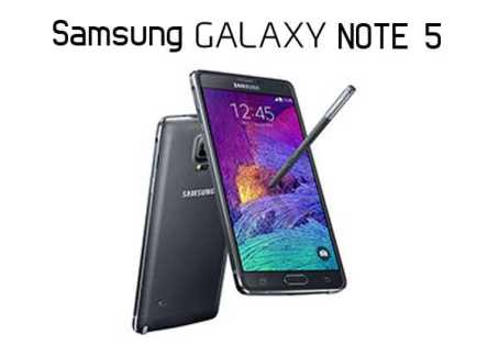
Samsung decided it was wise to move the Unpacked event up earlier than usual. In previous years, the unveiling of new devices took place a week before Apple’s fall iPhone launch. So last week, New York City hosted the Galaxy Note 5 launch extravaganza a few weeks sooner than previous years, introducing a pair of 5.7-inch devices: the flat, S-pen-equipped Galaxy Note 5 and the curved-screen, no-pen Galaxy S6 Edge Plus. At a first glance, it’s not wrong to say that in many ways, the Galaxy Note 5 is the larger version of the Galaxy S6, just as S6 Edge Plus is the larger version of the S6 Edge. The Galaxy Note 5 seems like a combination of the Galaxy S6 we’ve seen earlier this year with the Note 4 from last year, showing a familiar shape and size. However, even though Samsung recycled a lot of what we saw in the Galaxy S6, it is working hard at replacing the cheap plastic feel its previous devices had, with a glass back and front, held together by a metal chassis. Specs-wise, the Note 5 sports the same octa-core Samsung Exynos processor as the S6, with the difference that this time it’s paired with 4GB or RAM. The device comes with 32 or 64GB of storage, not offering the larger 128GB. What’s even worse is that the microSD card support is gone, and this might upset many of its fans. Further, the 3,000mAh battery is smaller than the one in last year’s Note 4, and the removable battery is also gone. As compensation, the company integrated wireless charging and quick charging. Note 5 has the same 16MP camera with OIS like the S6, and the 5.7-inch Super AMOULED display has the same quad HD resolution....
OnePlus 2
Improved and In Demand
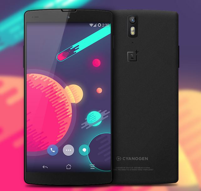
Remember last year’s $300 smartphone? If you liked it, soon is your chance to upgrade to the next generation of good, cheap smartphones built by the Chinese manufacturer OnePlus. Following OnePlus One – the little Android that could – OnePlus 2 has already requested by over 2.6 million people, even though the device has just been unveiled, with the official launch scheduled for later this month. The new OnePlus phone shows significant improvements to the specifications while keeping the price relatively low – $329 (£239) for 16GB, $389 (£289) for 64GB. Sandwiched in the middle of this meaty smartphone are high quality ingredients paired tastefully for a satisfying experience. OnePlus 2 is fueled by a Qualcomm Snapdragon 810 processor that’s been tweaked to correct the notorious overheating issue experienced in other phones. The octa-core runs at 1.8GHz with 4GB or RAM if you opt for the model with 64GB of internal storage; only 3GB of RAM are allocated for the 16GB version of the phone. Both have Adreno 430 GPU running graphics duty. The device is powered by a 3300mAh non-removable battery, ample enough to get you through the day without recharging. One of the downsides of the device is the missing micro-SD card slot and of the NFC chip (present on last year’s model). Yet, OnePlus 2 features dual nano SIM support with 4GT LTE capability. An interesting addition is the new USB Type C port and charger made popular by the new MacBook, making OnePlus 2 one of the few smartphones out there that’s laying the bricks for the adoption of the USB-C. Furthermore, the company claims that the OnePlus charging cable uses patented technology that makes the Type-A side reversible as well. The smartphone comes equipped with a fingerprint scanner too,...


